Do you ever wonder why some websites just seem to click with you the moment you land on them? It’s not just about the layout or the content – it’s also about the colors. Yes, colors can play a huge role in how your website connects with your audience, especially when you’re trying to reach people from all around the world. In this article, we’ll dive into the world of color harmony in web design and how you can tailor your brand’s color palette to resonate with a global audience.
The Psychology of Colors
Colors are like a universal language. They evoke emotions, set the tone, and trigger certain feelings. Imagine your website as a party, and colors are the guests – each one bringing their own vibe. Warm colors like red and orange can be like the life of the party, evoking excitement and energy. Cool colors like blue and green can offer a sense of calm and tranquility. But remember, interpretations can vary across cultures. While white symbolizes purity in some cultures, it signifies mourning in others. So, before you go all Picasso on your website, consider the cultural connotations of your color choices.
Crafting a Color Palette for Global Audiences
Creating a color palette that resonates globally is like cooking a diverse feast. You want to include flavors from all around the world, but they still need to work together harmoniously. Start with your brand’s core identity colors – those that define who you are. Then, expand this palette by adding culturally neutral colors like grays and neutrals. These can act as the “canvas” that allows your core colors to shine without clashing.
 The Art of Color Harmony
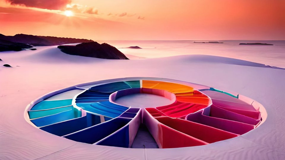
Imagine a symphony – each instrument has its own part to play, and when they come together, magic happens. Similarly, color harmony is about finding the right balance between your primary, secondary, and accent colors. Complementary colors, those opposite each other on the color wheel, can create a vibrant and dynamic contrast. Analogous colors, adjacent on the wheel, offer a more soothing and cohesive look. Experiment with different combinations until you find the harmony that sings to your global audience.
Adapting to Cultural Preferences
Different cultures have different aesthetic sensibilities. In some cultures, vibrant and bold colors are celebrated, while in others, subtlety and minimalism are preferred. Research the cultures you’re targeting – study their art, fashion, and design trends. This doesn’t mean you have to ditch your brand’s colors entirely, but you might need to tweak the shades or proportions to better align with cultural preferences.
Integrating Color Harmony into Web Development
The collaboration between web design and web development company is where color harmony truly comes to life. The website design should seamlessly integrate the chosen color palette, ensuring that the visual appeal isn’t compromised by technical constraints. Web developers play a crucial role in optimizing images and layouts to maintain the color integrity across devices and screen sizes.
Summary
In the colorful world of web design, understanding color harmony is like knowing the chords to play a beautiful melody. It’s not just about picking pretty colors – it’s about creating an emotional connection with your global audience. Your color choices can make your website feel familiar and inviting, or they can create a sense of discord. So, when you’re designing your web page, remember to consult the color wheel, consider cultural connotations, and strive for that perfect symphony of colors that resonates with hearts all around the world.
New boost

